Making Beautiful Plans on Planbook.com (Part 1)
 UPDATE: I’ve written two new posts with new time-saving tips for 2021! You can check them out below…
Adding Custom Colors to Planbook.com
Adding Icons to Planbook.com
Adding Custom Fonts to Planbook.com
. . . . . . . . . . . . . . . . . . . . . . . . . . . . . . . . . . . . . . . . . . . . . . . . . . . . . . . . . . . . . . . . . . . . . . . . . . . . . . . . . . . . . . . . . . . . . . . . . . . . . .
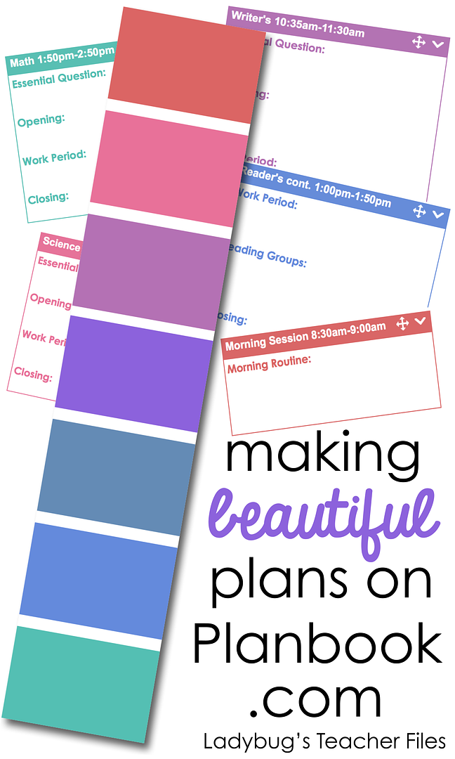
I’ve been using Planbook.com for a couple of years now and I just love everything about it. From attaching the printables I use every year, to linking websites we’ll need in a lesson, to setting up templates-everything about this site is convenient and saves me a great deal of time when lesson-planning.
And it’s beautiful.
UPDATE: I’ve written two new posts with new time-saving tips for 2021! You can check them out below…
Adding Custom Colors to Planbook.com
Adding Icons to Planbook.com
Adding Custom Fonts to Planbook.com
. . . . . . . . . . . . . . . . . . . . . . . . . . . . . . . . . . . . . . . . . . . . . . . . . . . . . . . . . . . . . . . . . . . . . . . . . . . . . . . . . . . . . . . . . . . . . . . . . . . . . .
I’ve been using Planbook.com for a couple of years now and I just love everything about it. From attaching the printables I use every year, to linking websites we’ll need in a lesson, to setting up templates-everything about this site is convenient and saves me a great deal of time when lesson-planning.
And it’s beautiful.(Which is important to many of us, isn’t it?)
I was not asked to blog about this plan book service, I just had to write another post about it because I love it so! All boxes have this great, clean layout and lots of color options. In the past, I used the same colors I use for color-coding my subject areas. This school year, I’ve changed things up and tried out some different color schemes. And I learned a couple of new tricks that have kept my plan book looking beautiful and easy-to-read when I am on the fly.
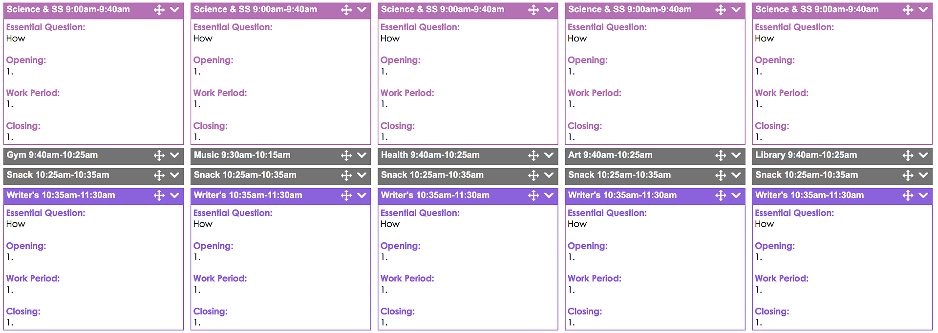 I like to use gray as a neutral color for the non-academic parts of our day, so my eye will go right to the subject areas I need to see.
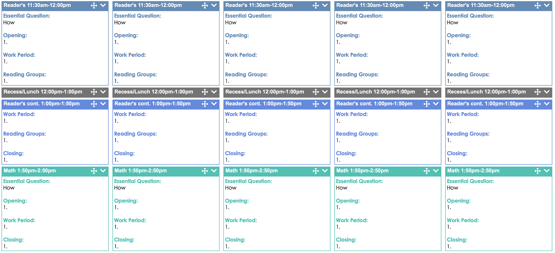 You can easily combine whatever colors you like best for your subject areas. Planbook.com also arranges the colors in rows of complementary shades…you can see them if you look horizontally at each row (it took me awhile to realize that, I’m embarrassed to say!).
 This helped me choose the color family I wanted to use (ok, who are we kidding? Color families…I’ve tried several this year!). Right now I’m working with the pinks, purples, and blues (calming tones for a calming planning experience, ha!).
The actual color-coding part is easy. Simply click on the class and then the class color.
 The next part is kind of fun. I like to colorize some of the text within each subject, so that the words stand out, rather than reading through a lot of black text. I colorize each section of our lessons, from the Essential Question to the Closing, and everything in between.

This helps me find each part of the lesson very quickly. And it just looks nice.
The great thing is, you can set this up in a template that will automatically fill out all of your lesson boxes for the year! Here’s how you can do this… Go into your plan book and click on the subject you want to set up first. Start to type the template as you would like it to appear. (I write the beginning of the Essential Question and the numbers for the steps of the lesson, so I can just highlight and type right over the black text later.)
I make any text I want to colorize bold, so it will really stand out. Then, I go into the html formatting part, where you see the < >. This is the source code.

Now you can tweak any parts of the code to get the exact look you want. I changed my font to Century Gothic. To change the color, highlight the hex color code (the # and letter/number combination).
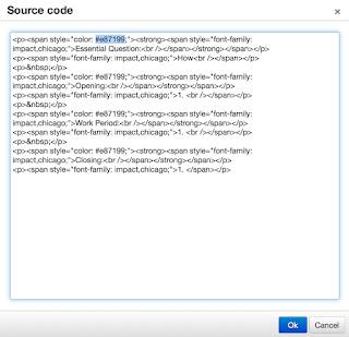
You can choose a similar color to your lesson box by using a color-picking tool if you have designing software with that feature. Or you can use an html color picker like this site (click the image for the link).

Type the hex color code each time you see it appear in this html section. I colorized four sections of my lessons, so I have to change the hex four times.
Now your text will match your lesson box and really stand out.
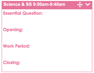 You can now make a template of this, so it is placed throughout your planbook…all color-coded and ready to go. First click on the lesson template you would like to copy. Select all of the text inside and copy it.
 Close this lesson box and go to the menu at the top right hand corner of your plan book. Select Templates from the drop down menu.
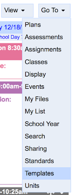 Add a new template.
 Choose the class for this template.
 Then paste in your formatted text.
 Now you can choose the dates you want this template to appear (I just chose the rest of my school year) and that’s that! Once you have done this for each of your classes, your color-coded lesson boxes will be ready for you to make some beautiful plans!
Do you use Planbook.com? Can you share your tips with us?
Now you can choose the dates you want this template to appear (I just chose the rest of my school year) and that’s that! Once you have done this for each of your classes, your color-coded lesson boxes will be ready for you to make some beautiful plans!
Do you use Planbook.com? Can you share your tips with us?Kristen Beakey
I’m an elementary math coach with a passion for sharing beautiful, streamlined solutions to save teachers time. Ladybug’s Teacher Files has been a work of love since 2010. Filled with visual tech tutorials and easy-to-implment math ideas…I strive to save you time in all aspects of your teaching!
