How to Add Custom Colors to Planbook.com
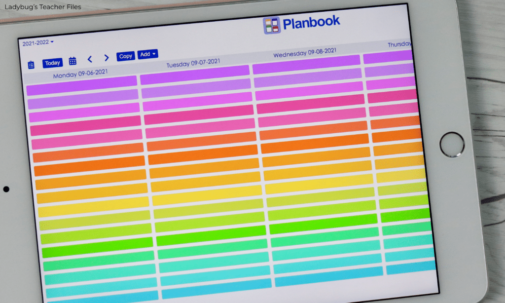
Do you use Planbook.com? I’ve tried SO many different planners over the years…from paper planners to ones I’ve created myself in Google Drive. But I always find myself coming back to Planbook.
It’s just so easy to customize and search through your old lesson plans!
I’ve never been asked to write an ad for them, so this is just me sharing what I love and how I make Planbook visually appealing and easy to read for my daily use. And today’s post is all about color…and how to add custom colors to Planbook.com!
We’ll be working on some quick tips to choose custom colors to brighten up your plan book with your favorite shades instead of those preset colors!
Before We Begin
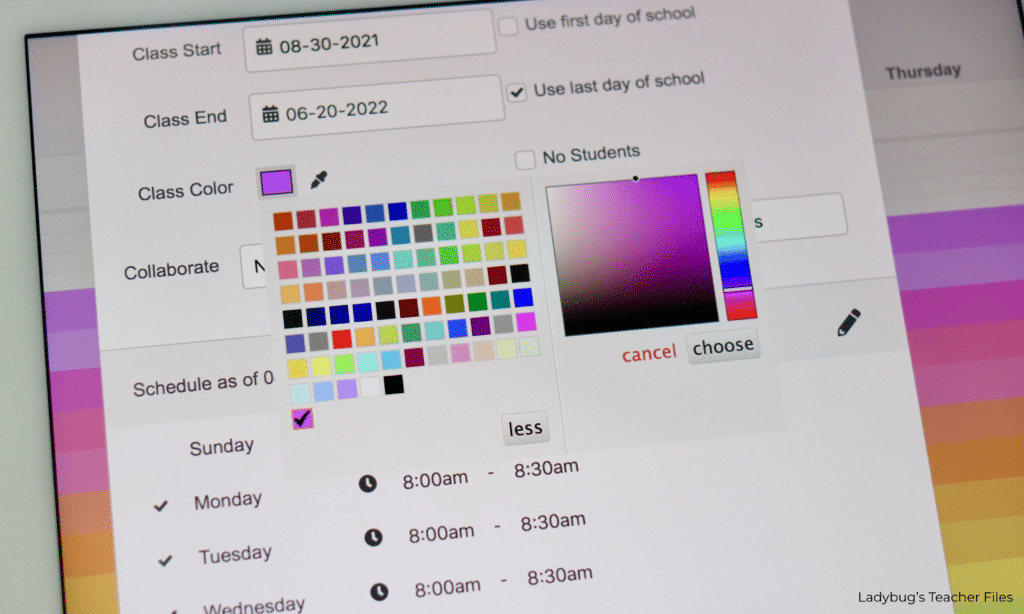
Before we go through the steps of customizing our colors, I must tell you Planbook.com does not currently offer a way to enter custom color codes (ugh!!).
I would share the exact color codes I use if I could (it would make things SO much easier for us!).
That’s the bad news.
The good news is I put together some Google Slides showing how I used the gradient sliders to find my favorite shades. I’m sharing the slides here so you can take a peek and try to copy the same layout if you would like to use these colors as well:
Ok, ready to begin??
How to Add Custom Colors to Planbook.com
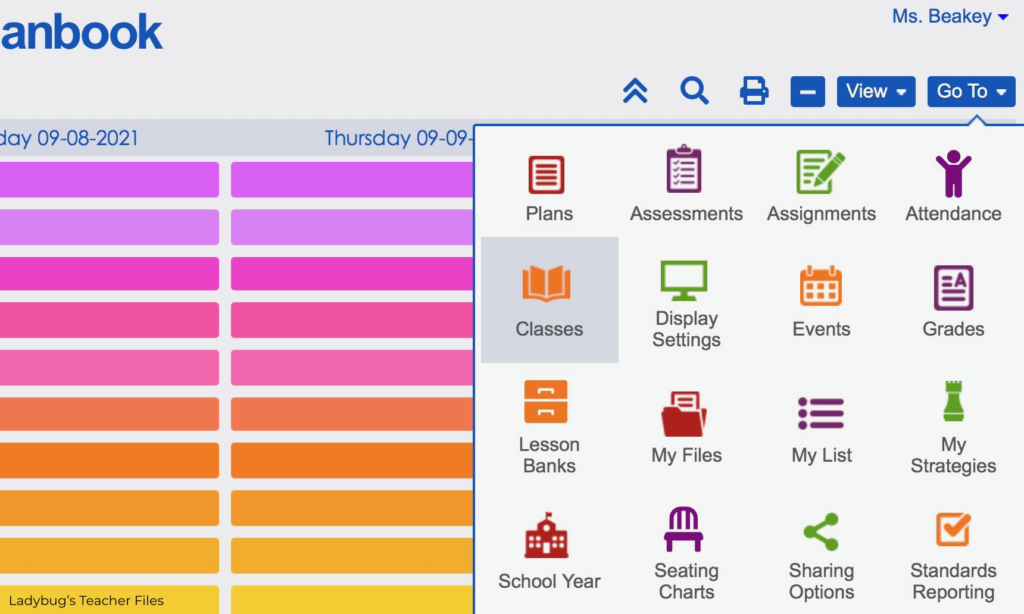
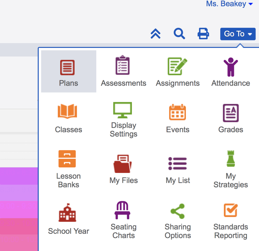
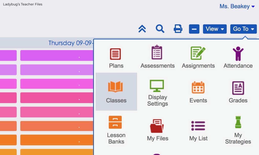
First, we will head to the Classes section. You can find this under the Go To dropdown menu:
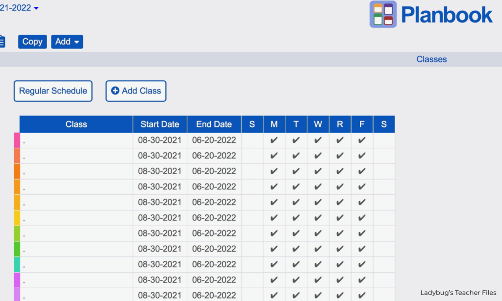
You will probably see a view like this first (if you have classes already created). It will be a vertical list of classes:
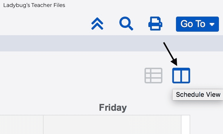
We will need the Schedule View to make these next steps the easiest for us. Head to the top, righthand corner of this screen. Click on the icon with two columns for the Schedule View:
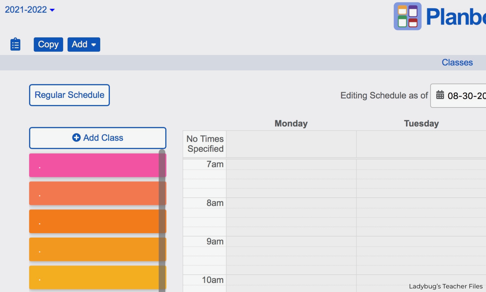
This will take you to weekly view of all your classes. I’ve added a few classes in the example below with some different colors:
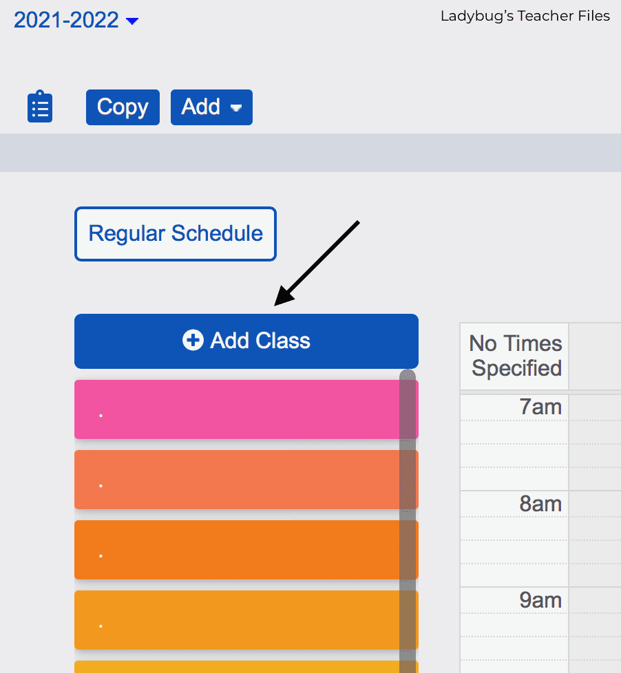
Click on the Add Class button to start creating your color templates:
A new class will be created at the top of the list:
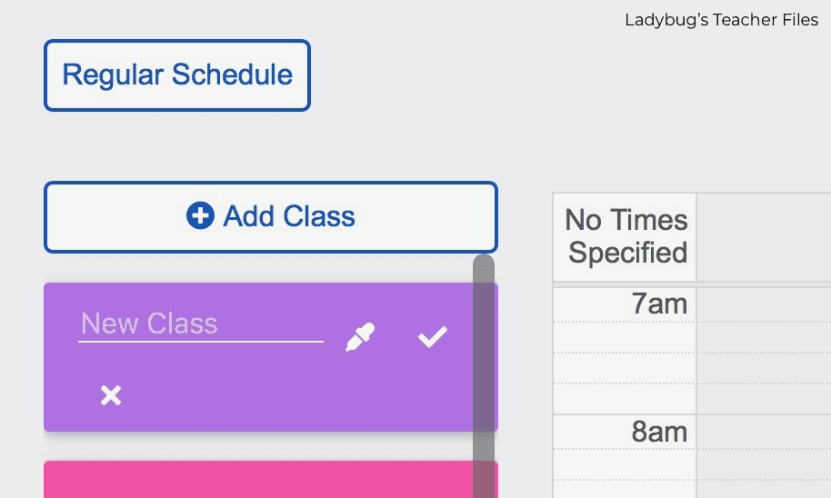
You will need to name your class first. To get the look we talked about at the beginning of this post, I just use a dot for the class name:
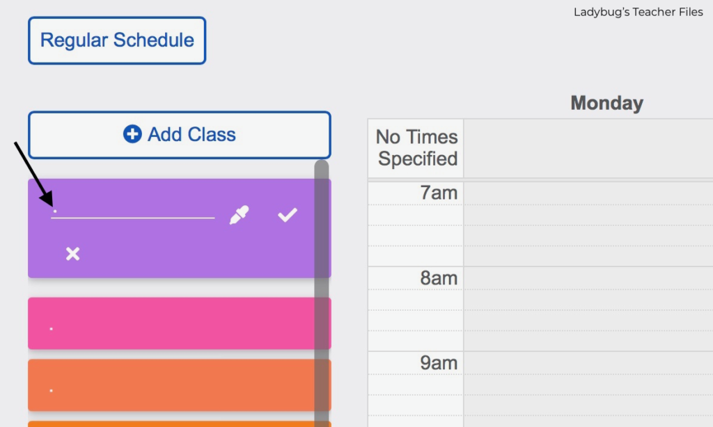
Now you can start choosing the colors you would like!
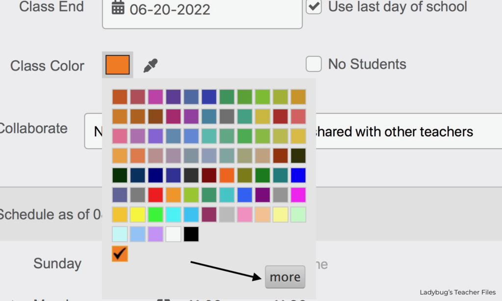
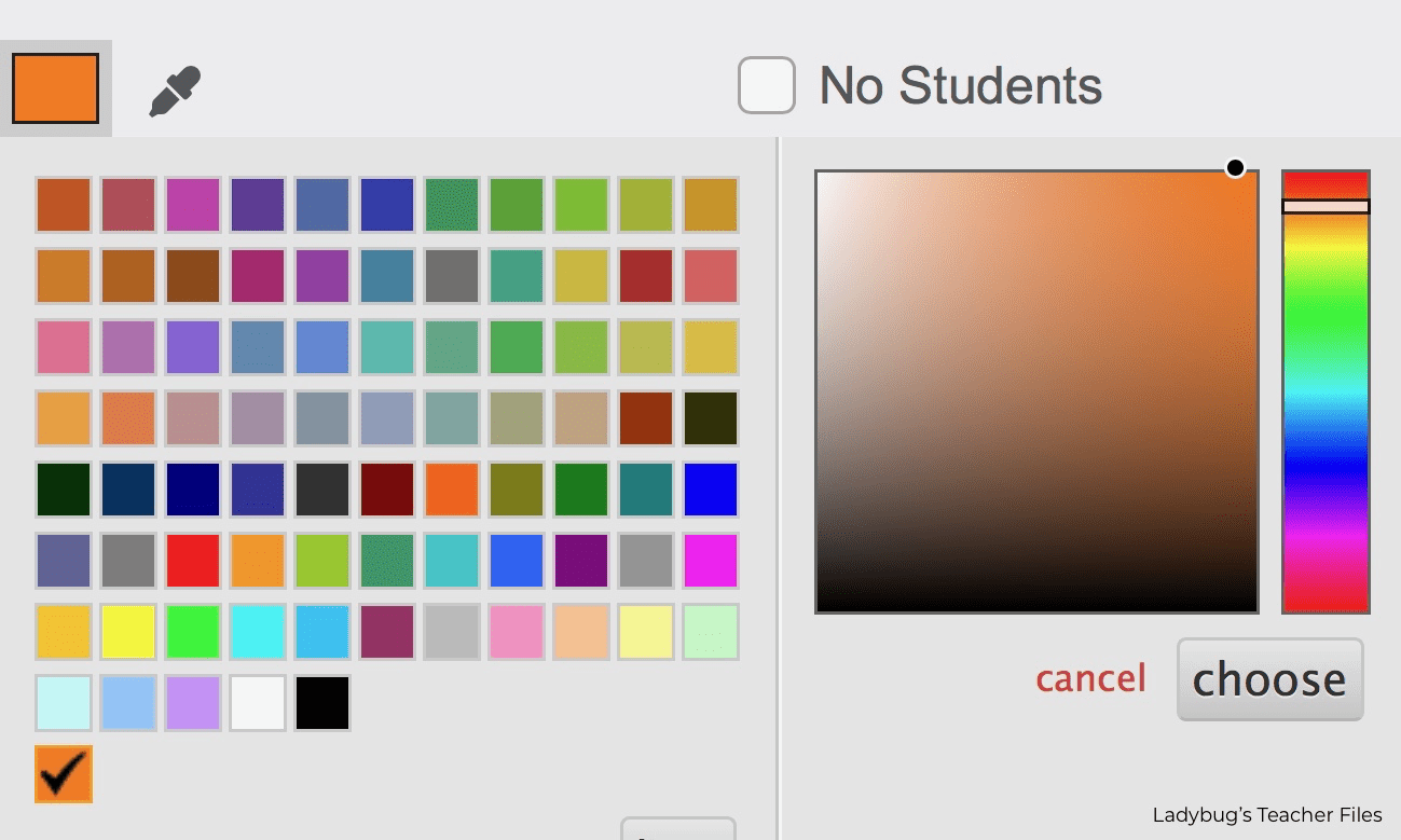
Instead of using the preselected colors, I like to click on More and use the color sliders to choose the exact shades I like best:
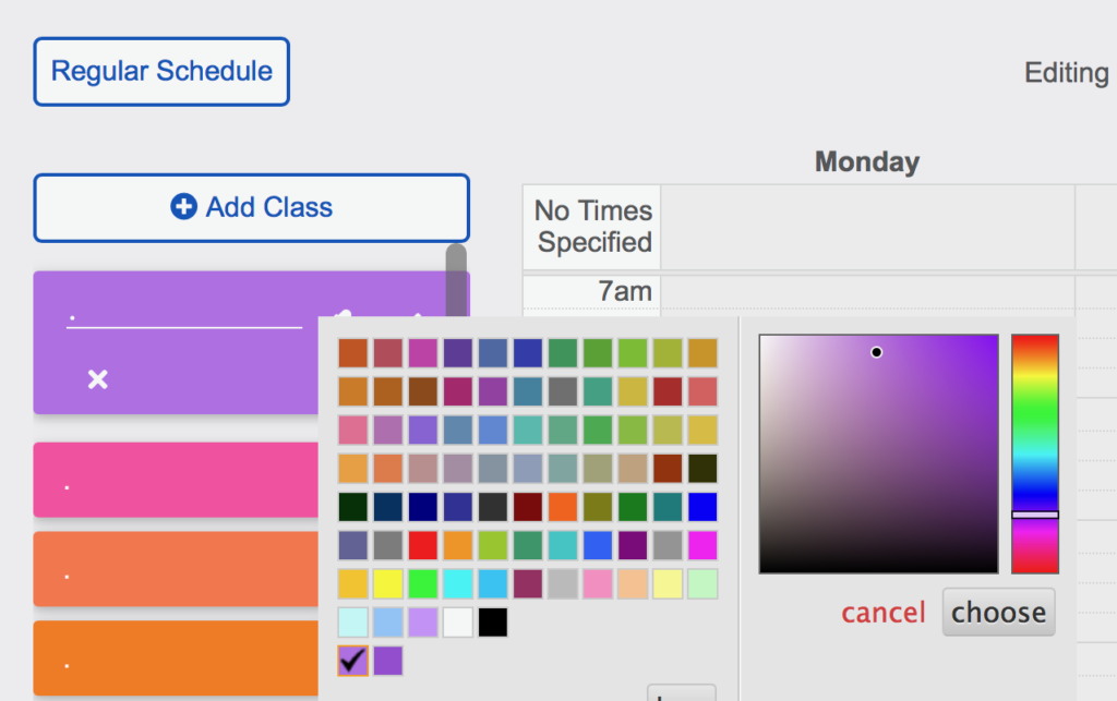
Once you have the color you want, click the check mark to close this class and move on to the next:
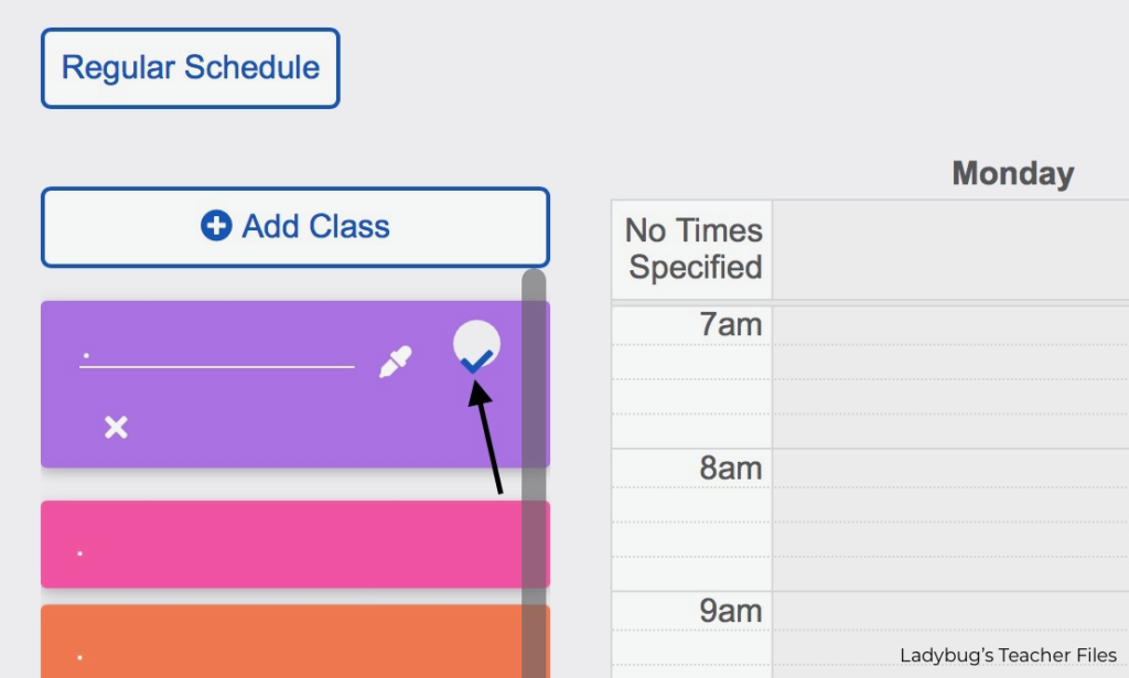
Keep selecting new classes, name them with the dot, and choose the shades you would like. Don’t worry about the order yet, we will fix that next!
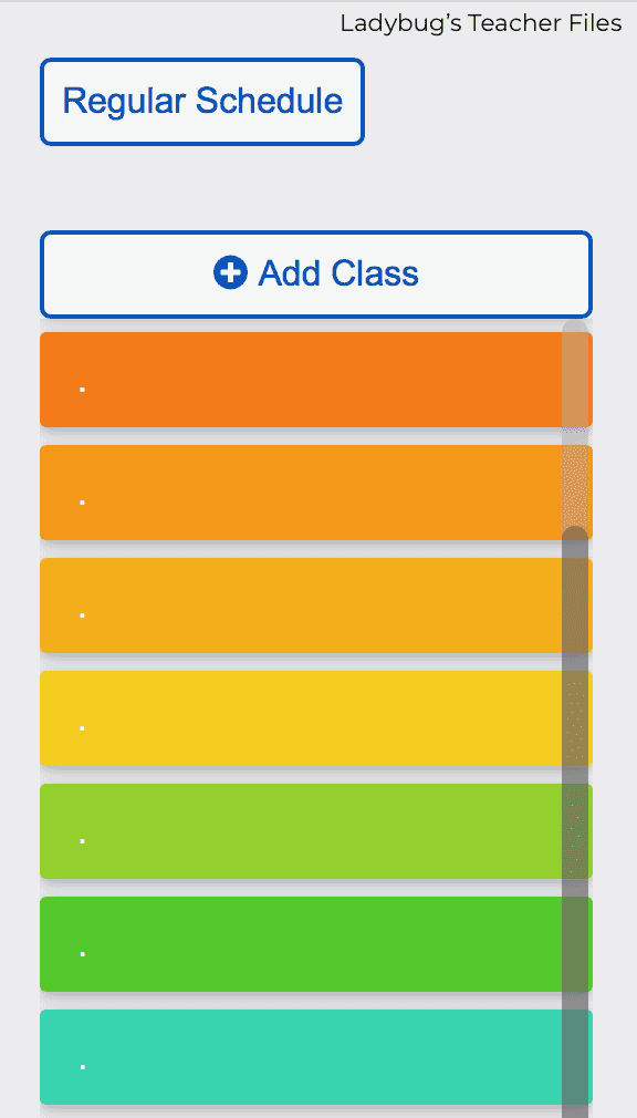
When you are ready to start putting your classes in order, grab one of the classes and drag it to the weekly grid on the right. You can slide it onto any part of the schedule and adjust the times as needed.
I set my times to half hour increments (NOT my class schedule, ha!) to make it easy to look at all of the colors at once. We can adjust the true times later:
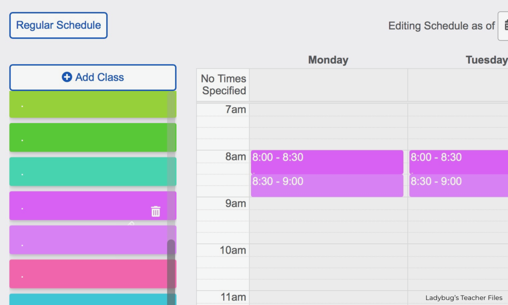
As you drag more classes onto the weekly grid, you can move them around to see the order you would like your colors to appear.
You can also leave some space, in case you want to create new colors in between:
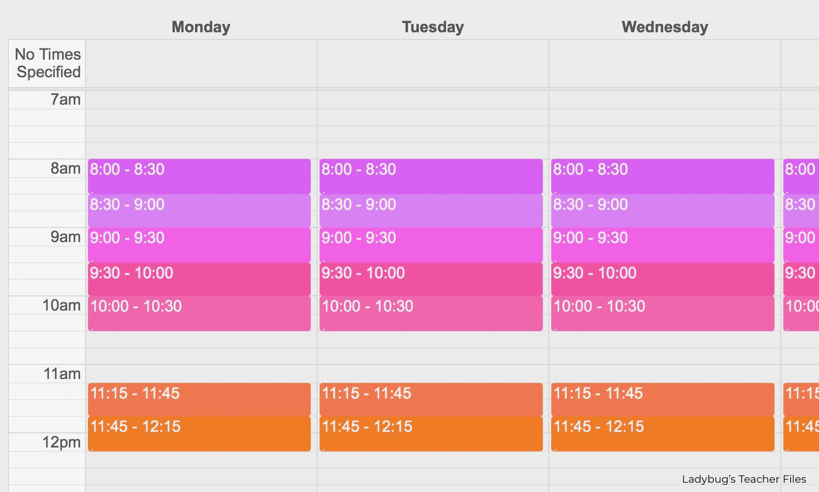
This is a look at all the colors I chose for my different classes (still not adding the real times yet!):
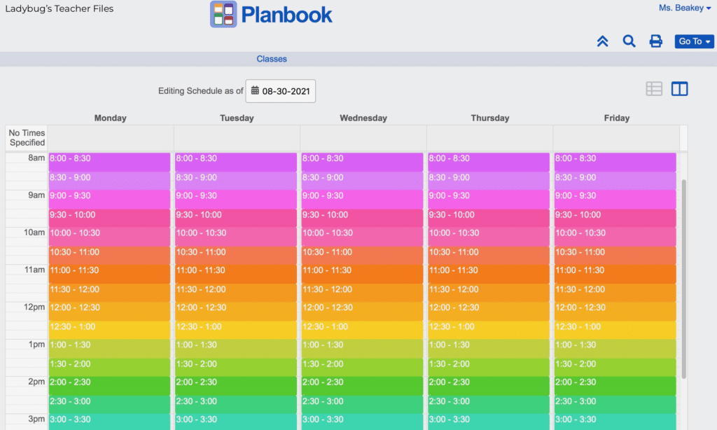
To see how the colors will look in your planbook, head to the menu at the top right and click the Go To menu then click Plans:
Ok, so it looks a little messy with all those dots and times…but we can fix that right now!
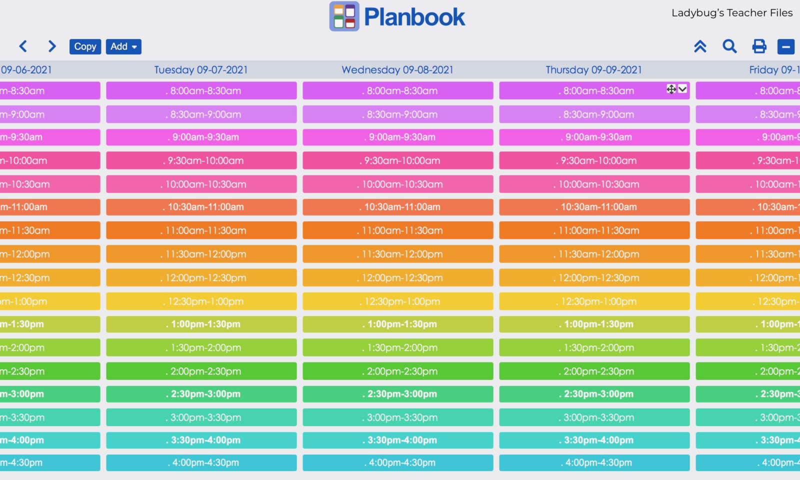
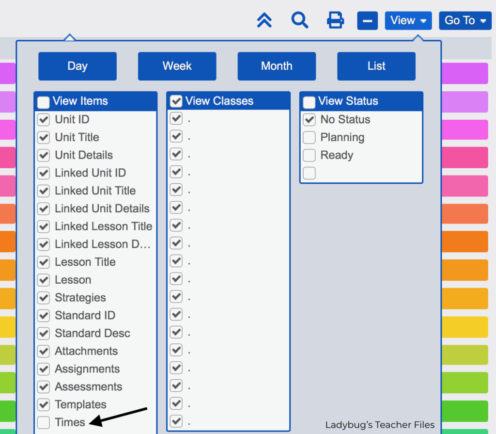
Now our plans are looking less cluttered! You can take a look at your colors and see if you are happy with them:
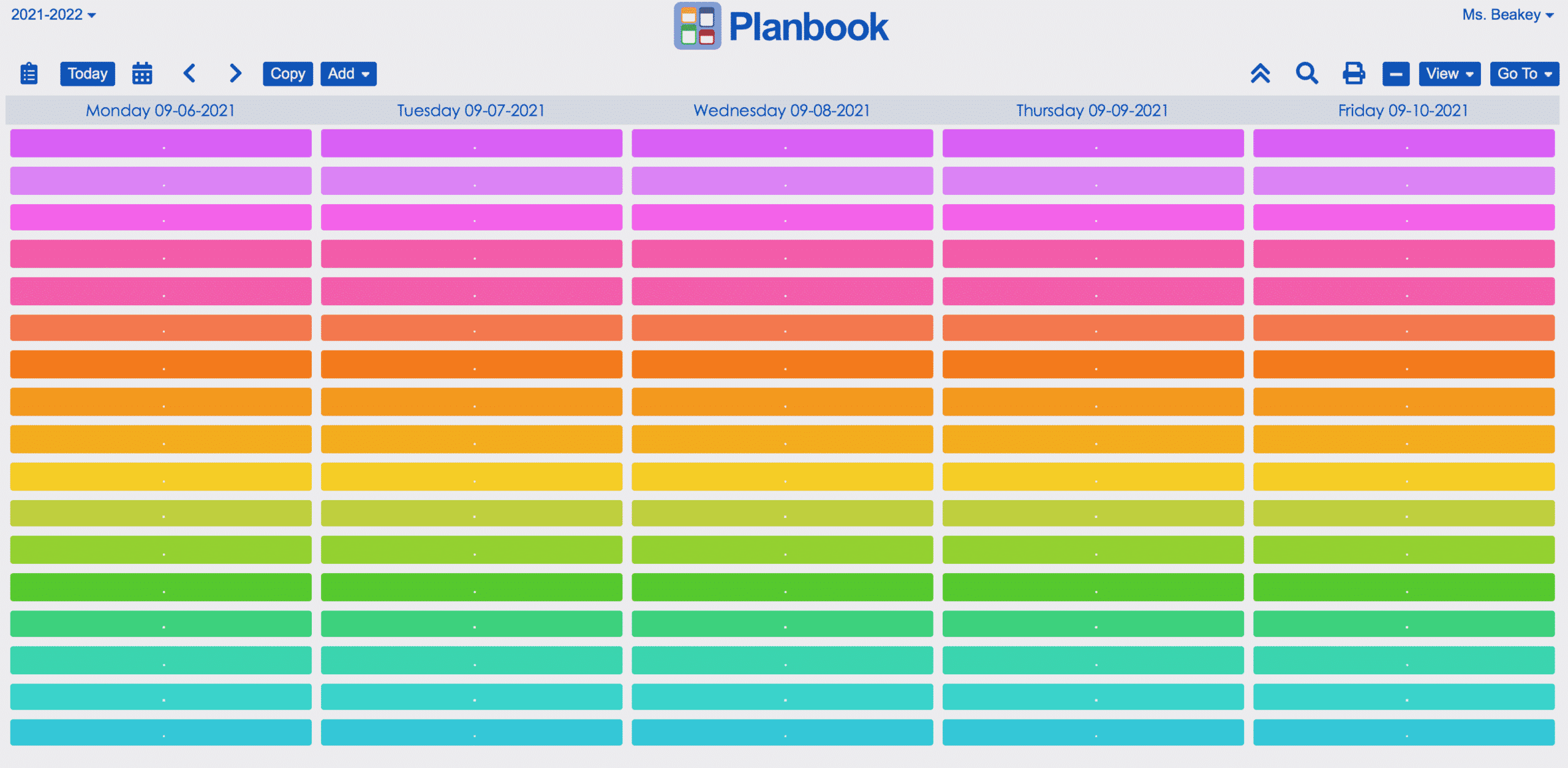
Now let’s take care of those little dots in the class name area!
Head to the Go To menu again and choose Classes to go back to your class colors:
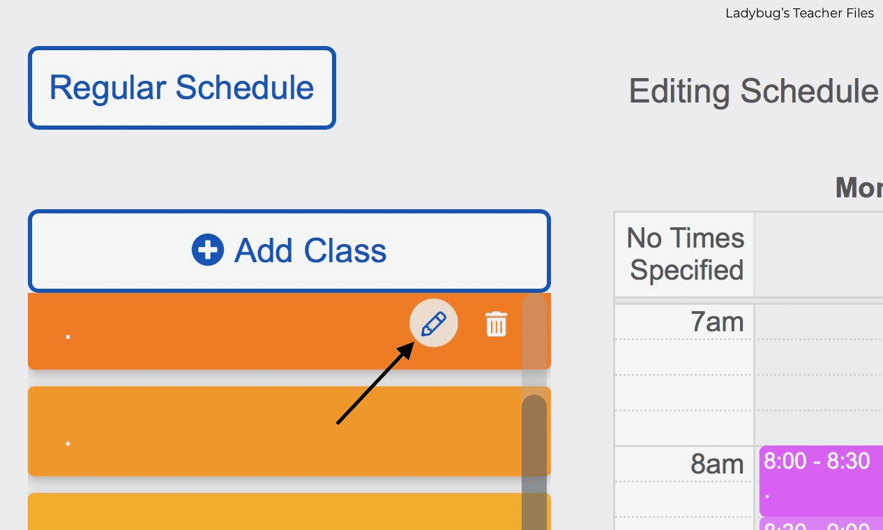
Choose your first class and click on the pencil icon to edit:
Click on the Class Color you chose earlier, then click the More button:
Take a close look at where the color gradient is…this will help you with the next step:
Now we will format the text (that little dot) so it’s the same shade and it will “disappear” from view.
Go to the three dots at the righthand side of your class.
Click on Format and then choose the same color (as close as you can, it takes a couple of tries sometimes!). Click the Choose button and then click the check mark when you are finished:
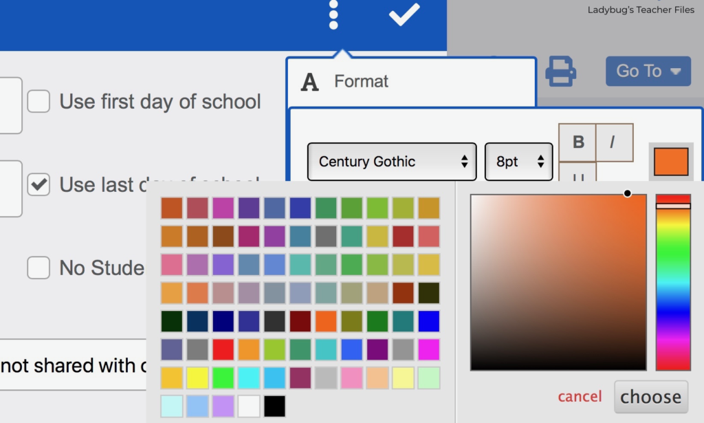
You can see if you chose the right color by looking at the time on your template. My text was a bit dark this time so I need to move the gradient to make it a bit lighter:
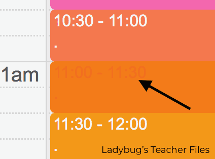
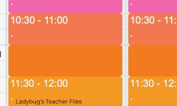
You’ll know you have the right color when the time “disappears”.
Don’t worry too much about getting the exact shade…since we named all the classes with a little dot, we won’t really see it anyhow!
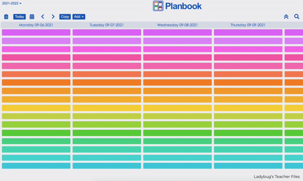
Once you do this for each class, head back to your main planbook page and you should see all your colors ready to go!
And’s that’s it for colors! I truly hope this was of some help in customizing with your favorite shades. Please be sure to check out the other posts in this series:
How to Add Icons to Planbook.com
How to Add Custom Fonts to Planbook.com
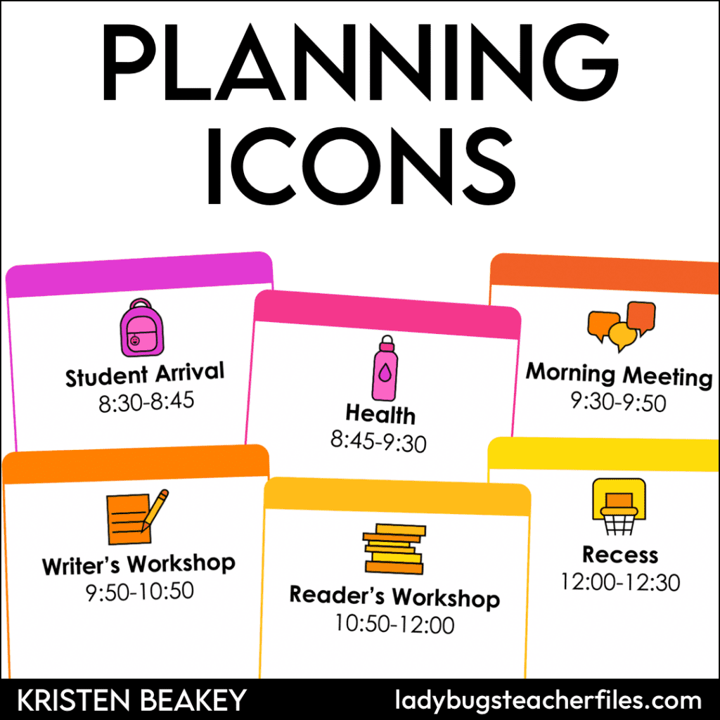
And if you rely on visuals like I do, please check out these Digital Planning Icons. They make finding lessons on the fly so much easier!
Kristen Beakey
I’m an elementary math coach with a passion for sharing beautiful, streamlined solutions to save teachers time. Ladybug’s Teacher Files has been a work of love since 2010. Filled with visual tech tutorials and easy-to-implment math ideas…I strive to save you time in all aspects of your teaching!

