Using a Class Website for Parent Information Night
share this timesaver:
- I’m setting up all of my information I’d like to share with my parents during Parent Information Night.
- I’m planning out the major parts of my year as I create the site.
- I’m linking up frequently-visited kid sites my class continually uses throughout the year.
And, really, I have no idea why I’ve never thought of this before. In the past, I’ve always gone with Powerpoint Presentations during Parent Information Night, which are informative and all…but just for that one moment. And I imagine as I nervously speed-talk through all of that important information, my poor parents are completely inundated with systems and procedures. With a website/blog, they can go back and read at their leisure, should they want more information than provided in the 15 minute presentation.
For this particular site I’m using Blogger. I call it our website rather than blog because, with Blogger’s page features, it is very easy to make the whole layout more website-like…with the blog part being the home page featuring updates and class news.
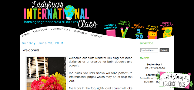
So, here’s a breakdown of what I have so far my website, as well as how it will be presented during our Parent Information Night…
No, my students don’t call me Ladybug, this is just a little sample of what our page looks like. I called it our International Class because that is our informal name…as some of you know I teach a half EL newcomer, half mainstream 5th grade class and it is simply amazing. This will be my second year of teaching such a class 🙂
So. I decided to keep the site pretty simple, that way it wouldn’t have too much information to navigate through.
One of the most important features will be the Subcribe widget…
which, as so many of you already know, will allow my parents to sign up for email updates from the blog. I placed this at the very top of my sidebar and it will be one of the first features I present to my students’ parents.
I know how busy parents can be and I certainly don’t expect them to frequently visit our class blog on top of everything else they already do…I’m hoping this feature will provide an easy way for them to stay informed of upcoming events and projects, as it will be delivered right to their inbox.
I only have two other widgets in the sidebar…
Events for the month (for a quick, at-a-glance resource) and the Translate feature (since I have many wonderful families from different countries).
The home page itself will be the blog of updates.
The black text links are pages for parents…
That second tab, Classroom, will take the parents to a page full of information, from homework policies to various subject areas.
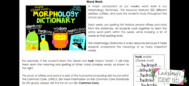
Each of those sub-headings can be clicked and will jump down the page to the section containing that information. For example, parents can click on Word Work…
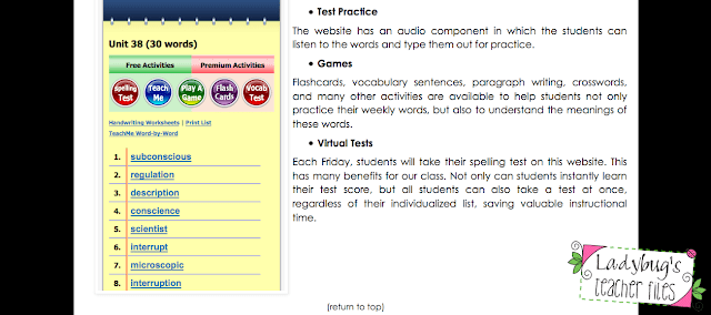
and will be taken to a section explaining all about this subject…
Since this page has so much information, it is the one I will be presenting the most during Parent Information Night. Since it is all organized into different categories, it will give me plenty of talking points. And, since I won’t be able to cover everything during the presentation, I can easily reference this page as a source of information that can be visited at home.
At the end of each section, there is a Return to Top feature, to help with easy navigation (and hopefully save some time!).
This Classroom page has the bulk of the information on our site. I did include a few other pages as well.
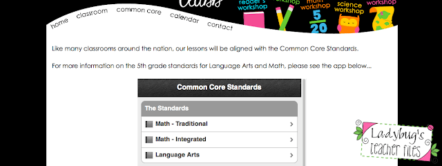
As this will be our first official year of Common Core, I did want to include a page on it, so parents could read about the standards. This was the easiest page of all because Mastery Connect has the code for a Common Core app and widget!
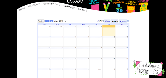
The same was true of the Calendar page…
Using my Google Calendar account, I could just import our district dates right to this website calendar very easily. Not much to show here in July though 🙂
The final parent page is my contact information.
I left this at the end of the page list because it stands out and will be easy for my students’ parents to find. I also kept this page very simple, just my email information and that’s it.
The remaining pages are those fun little guys on the right hand side of the site. Those are for my students and will feature websites and apps we use during the school year. Now this is something I have always done with my class and it’s very helpful for both school and home for my students.
And that’s all I have! I really tried to keep it pretty simple and basic…I know I get lost easily when I go to a website that has a lot of information and menus (is it bad to admit that???).
If you would like more information on making those page jumps (return to top) or adding any of those widgets, please let me know and I can in explain in more detail.
Do you have tips to share for keeping parents informed? Maybe you would like to link up with Optimum Organization, we would love to have you join us!
Kristen Beakey
I’m an elementary math coach with a passion for sharing beautiful, streamlined solutions to save teachers time. Ladybug’s Teacher Files has been a work of love since 2010. Filled with tech tutorials, math ideas, and organization…I strive to save you time in all aspects of your teaching!

