How to Make a Class Website with Google Sites
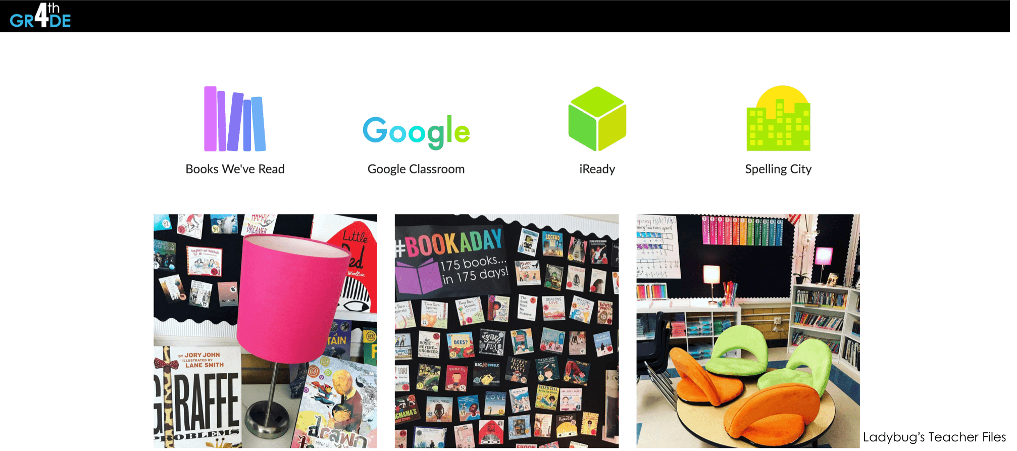
I have kept a classroom website for as long as I can remember. And I used to keep very elaborate sites! I remember the years when I had extensive information about each subject for parents…it’s probably around here on my blog somewhere!
But a LOT has changed over time.
And people don’t always have the opportunity to read websites like they used to. So my class website has morphed back into a simpler form.
In fact, what you see in that top image? That’s it. That’s my class website.
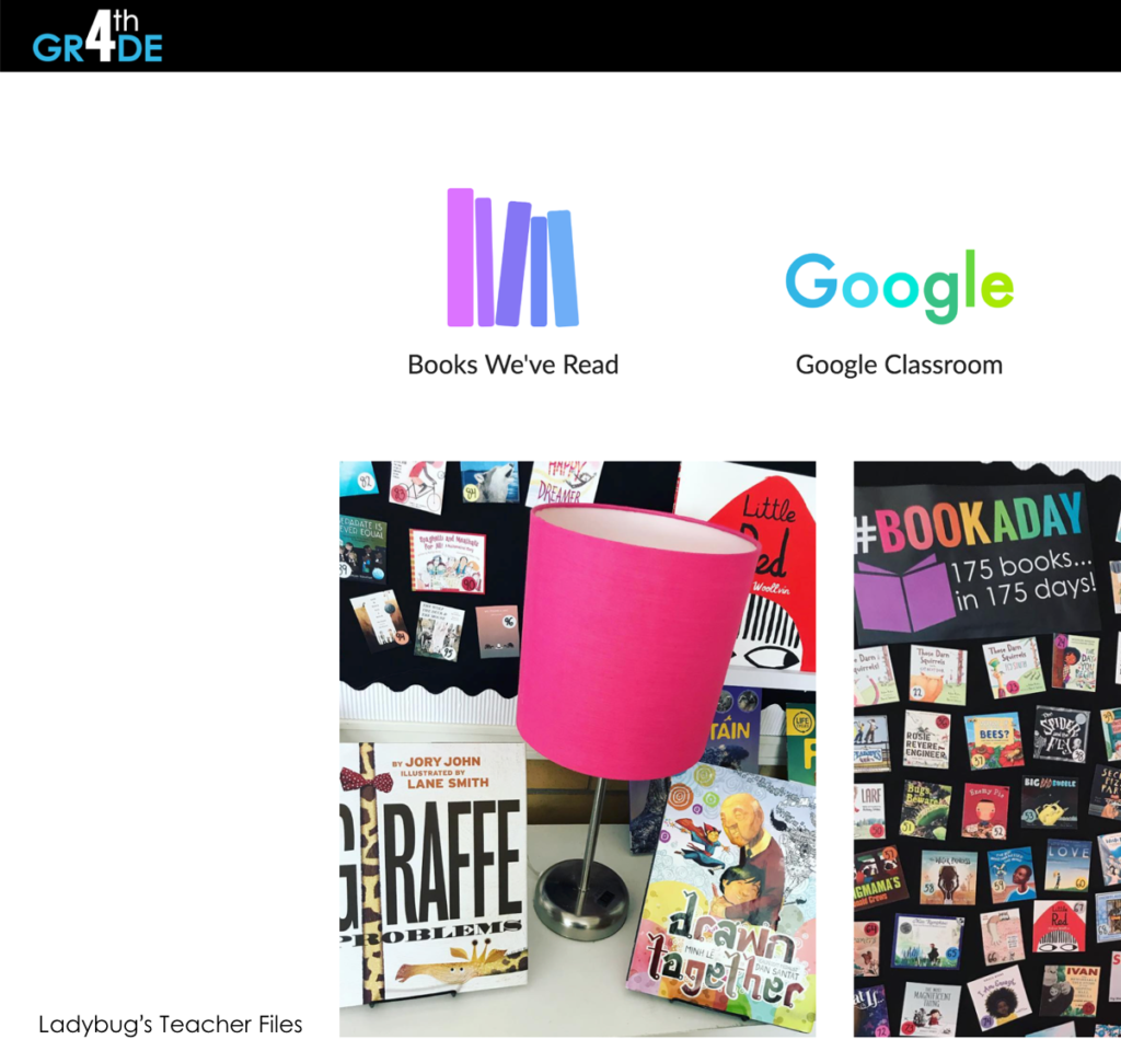
No pages, no extensive list of links…just a landing page of our most important go-tos.
I’ll be breaking down the links I use for my students later in this post. But first, to share how to get a Google Sites website up and running.
First, google “new google sites” (see what I did there?). This will take you to a page to launch your first site:

Click the + mark at the very bottom, righthand side of the page. Name your new site. (The example I am creating will be just like my class website…just a second copy to keep our website anonymous).
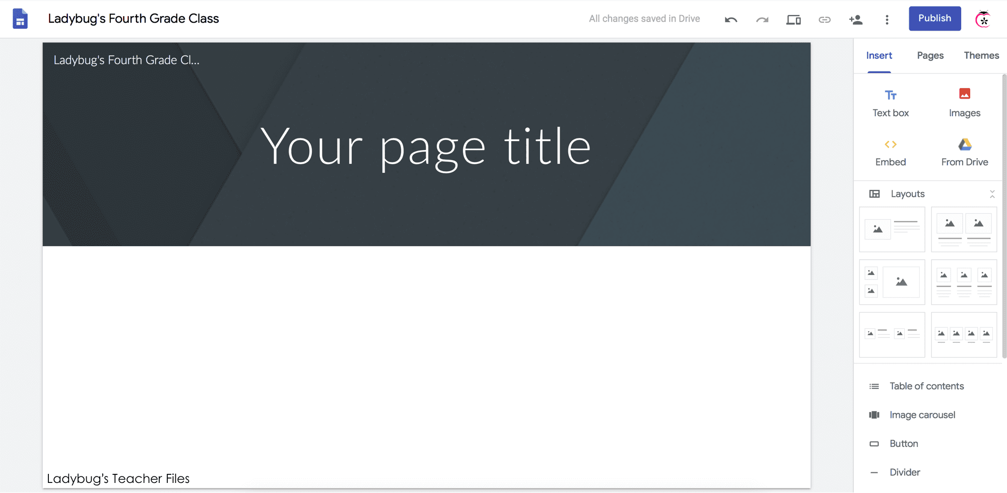
The default site comes with a header, ready to use. I honestly have a hard time with these headers. The pre-loaded images aren’t super amazing for education…and if you upload a photo, it’s very hard to get it sized accurately.
If you’d like to add a header, click on the large banner at the top and you will see options to upload or choose images:
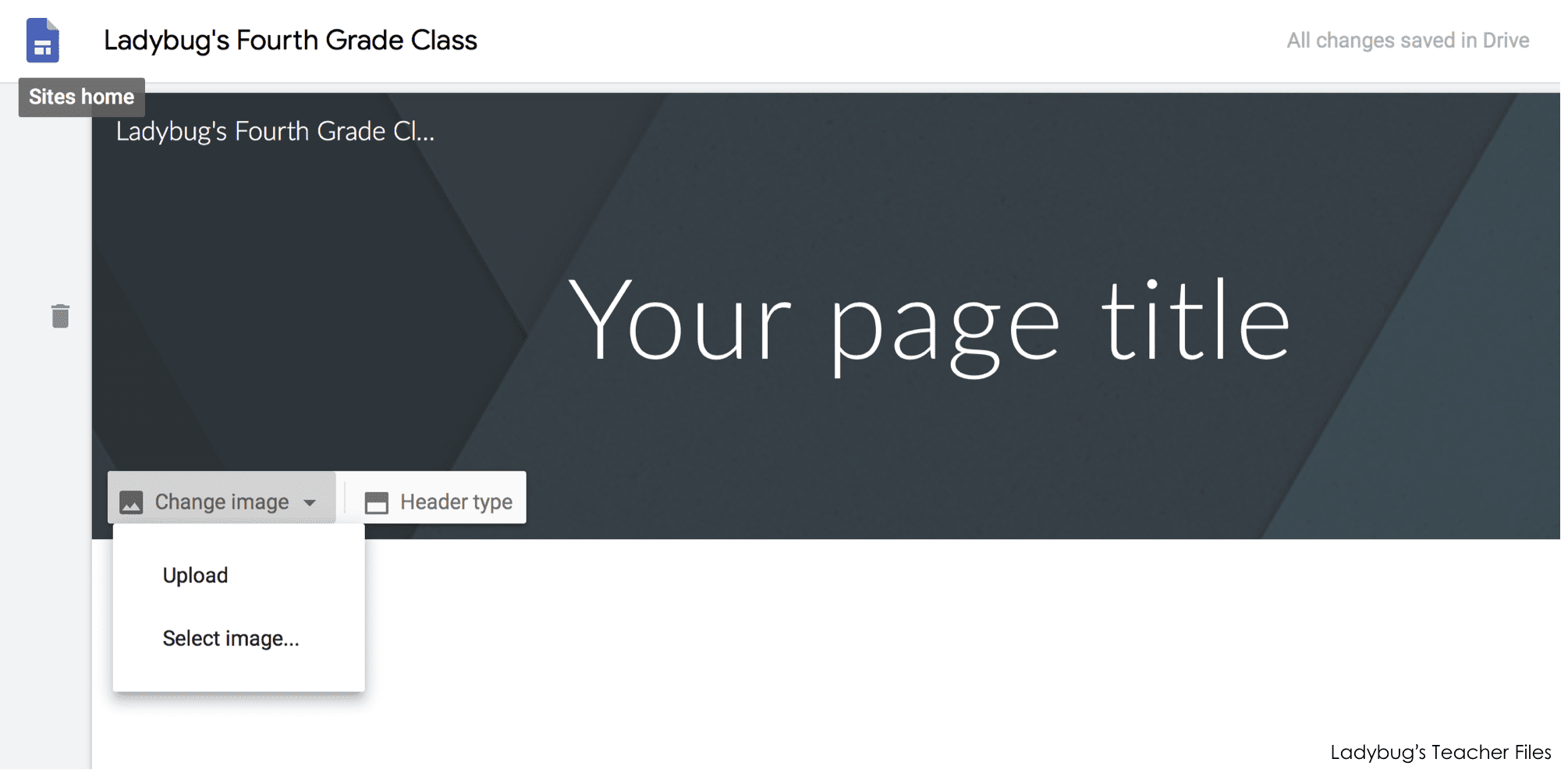
Since I wanted a simple landing page for my students, I removed the header completely and opted for more of a clean look.
To start designing your site, head over to the righthand side of the page and choose “Themes”.
So the interesting thing about Google Sites is there is very little choice as to the “look” of your site. Once you choose a template, you are able to add colors of choice. But the fonts are set…you have a choice of three fonts within each template:
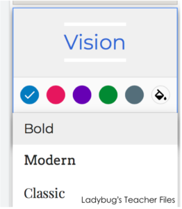
So I ended up choosing a template with the fonts I liked best, which is the Simple template with the Light font:
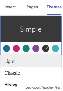
After you’ve chosen your favorite theme, you can start adding photos, files, and links.
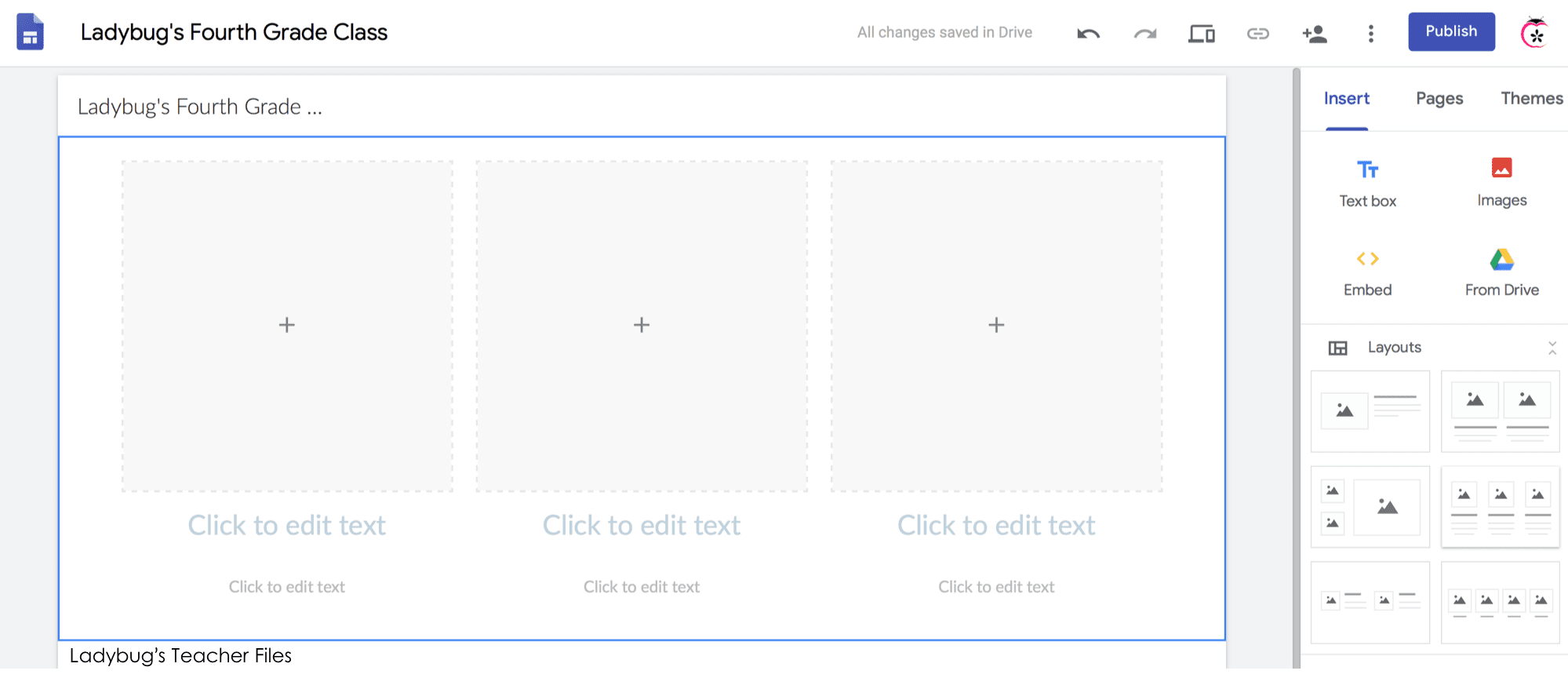
Go to the “Insert” menu.
You will find a very long dropdown menu of choices…here you can add text, photos, files from your Drive, and more.
You can also choose the layout of your page, which helps keep things very balanced:
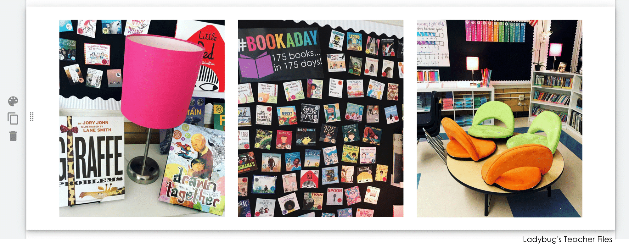
For our site, I added a few images from our classrooom for visual interest. I also designed some buttons at the top to link to our most-used websites. (Using Google Classroom has really eliminated the need for all those website pages I used to have, since I can now put all assignments and wesite links by subject in there…a post for the near future!).
Adding Photos
There are two ways to add photographs. If you would like them to all be the same size and consistent across the page, it will be best to use one of the layout options:
Once you have chosen a layout, click the + sign to add a photograph:
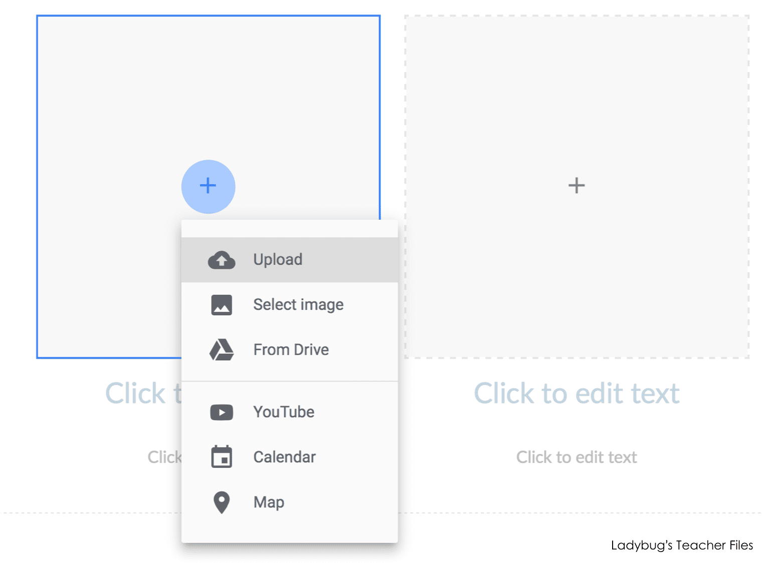
Your photos can have subheadings and caption text if you would like. I kept mine blank on my website. If you would like to remove the text, just click delete as you hover over each text option:
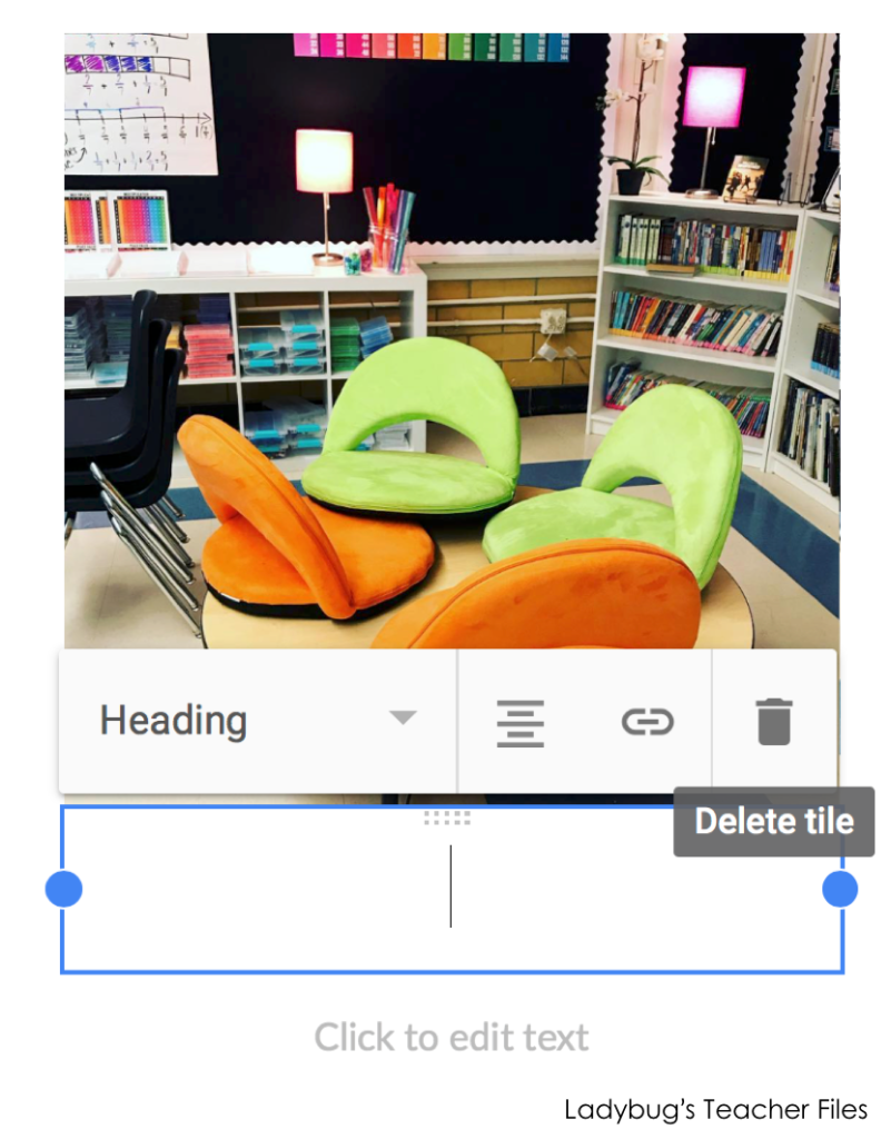
Once all of your photos have been uploaded, you can click and drag them to change the order.
The great thing about using the layout feature is all of your photos will be the same size and fit on the page nicely:
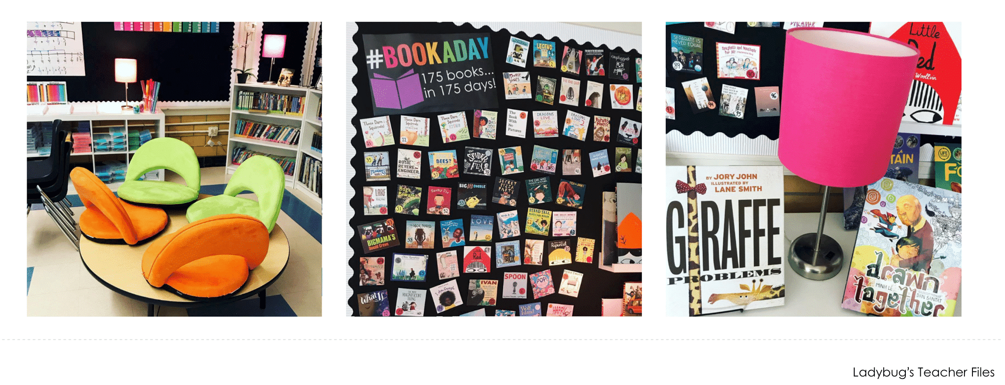
The downside to using the layout feature is that your photos will be cropped.
If you would like your photographs to display larger, you can also upload them one at a time without the layout option:
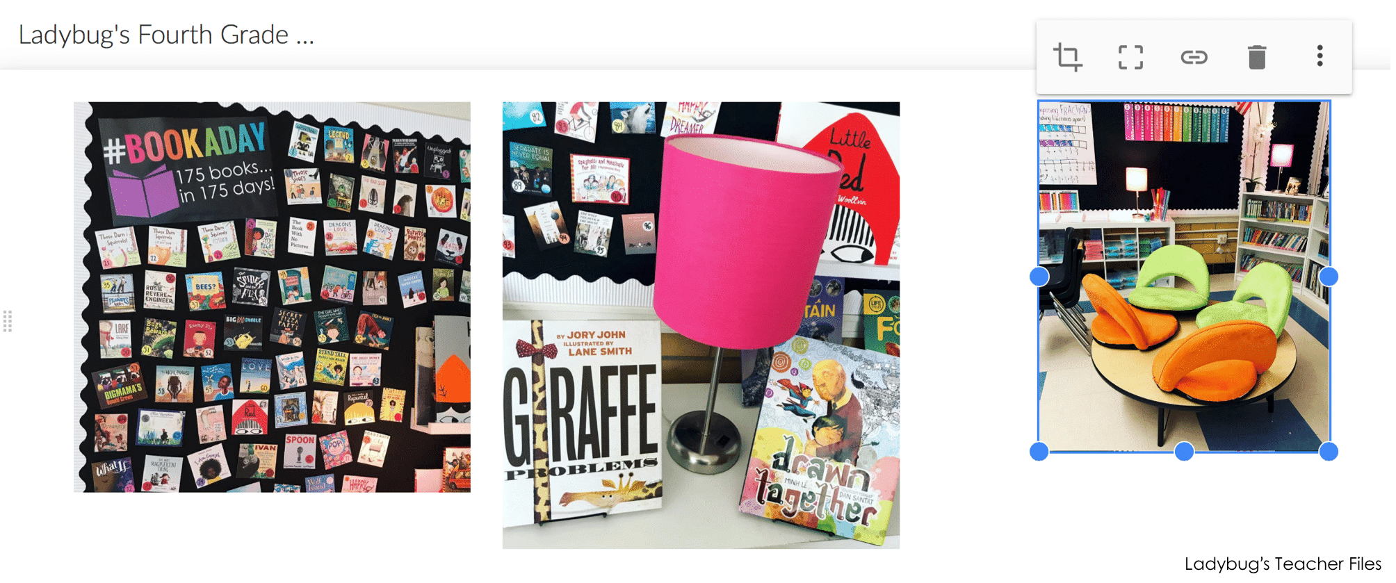
You will have some more freedom when it comes to sizing your photos with this option, so they will be less cropped (but it does require a bit of maneuvering!).
Google Sites will help by showing guidelines as you resize your photos, so you can set them to the same size and a balanced layout:
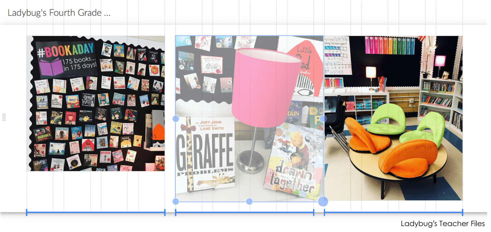
Once you have your photos sized to your liking, you are all set!
You can always delete or move any section. If you click on the lefthand side of your site, you will see a menu pop up to copy, move, or delete your content:
Adding Icons/Clipart
This part will require a bit more work!
I like to use visual icons for my students. I make my designs in Adobe Illustrator. If you don’t have this program, you can also design buttons in PowerPoint using clipart (and a file I’m sharing below to help!).
Sizing the icons was the hardest part for me.
There is not a super ton of size control on Google Sites…so if you add a little icon to the page and try to increase the size a bit, it sometimes jumps to a huge size!
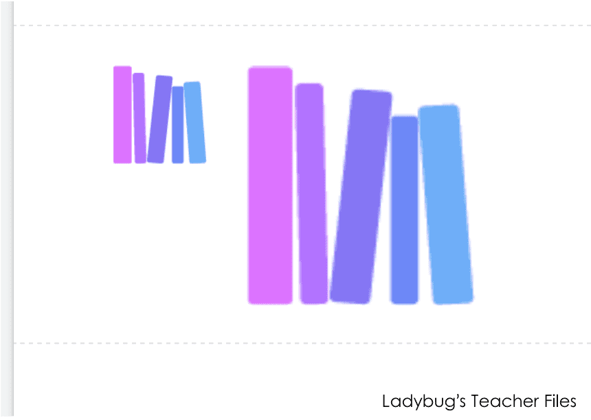
(You can see above…the icon went from being tiny and the next size up was too large!)
Luckily there is a workaround for this!
If you use a white square or rectangle and place your design on top of it, this will help balance all of your icons/clipart.
To help with this, I made a PowerPoint file with a white rectangle already sized for you! Here are the steps to use it…
Click here to open the PowerPoint file. It will open as Google Slides. To use it as a PowerPoint, go to File, Download As, and choose PowerPoint.
Once you open this file in PowerPoint, you will see a rectangle and square like this:
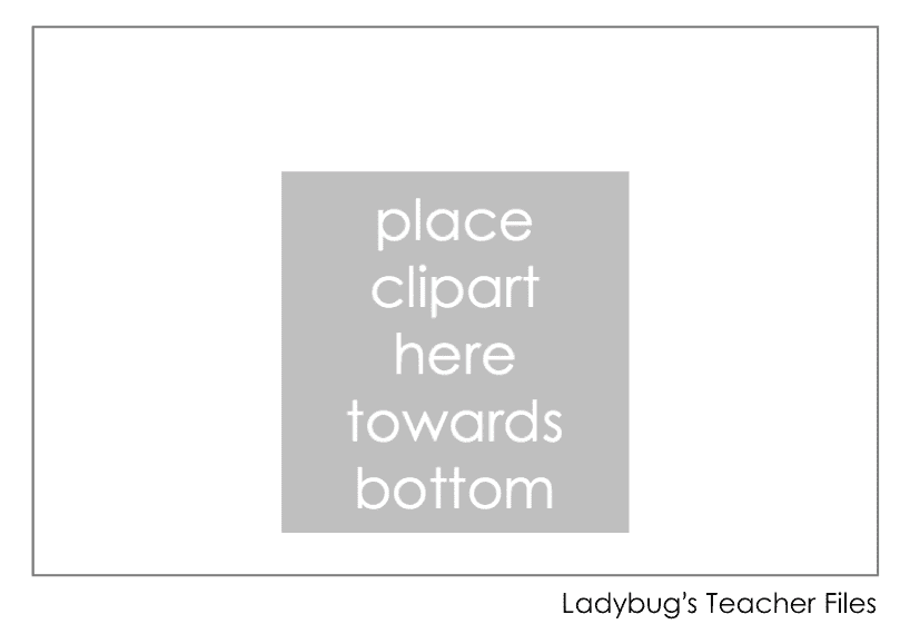
Add any icon/clipart you would like for your website over the gray square. Delete the gray square. You will want to keep your icon centered on the rectangle and close to the bottom of it (this will make your icon/clipart close to the text you type under it later on):
Now select both your icon and the rectangle. Copy and paste them three times on the PowerPoint slide, so you can make the rest of your icons/clipart.
These rectangles are sized to make four icons total. Once you have designed all four, you can remove the gray lines on all the white rectangles so they don’t show on your website.
Click on each of the white rectangles (not your clipart) and change the line from gray to no line:
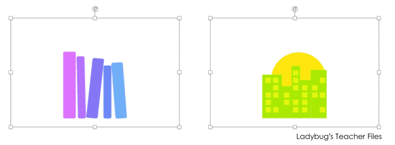
Now you are ready to save each icon separately. Click on one rectangle. Hold Shift and click on the clipart in that rectangle.
Now both should be selected. You can also click and drag over both to select them:
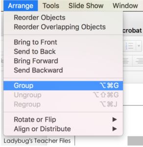
Go to Arrange and choose Group, so your rectangle and clipart are now one picture:
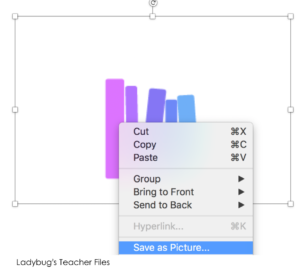
Right-click on the icon and choose Save As…
Do the same for each of your iconos, then head back to your Google Site.
As you upload the first icon, try to resize it as shown below (about five columns wide). You can resize by clicking on the icon and grabbing a diagonal corner to adjust it:
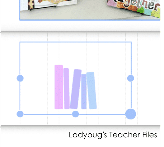
You will need to uncrop the icon as well, so it will fit nicely:
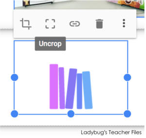
Now you can copy and paste this icon three times on your page, for a total of four:

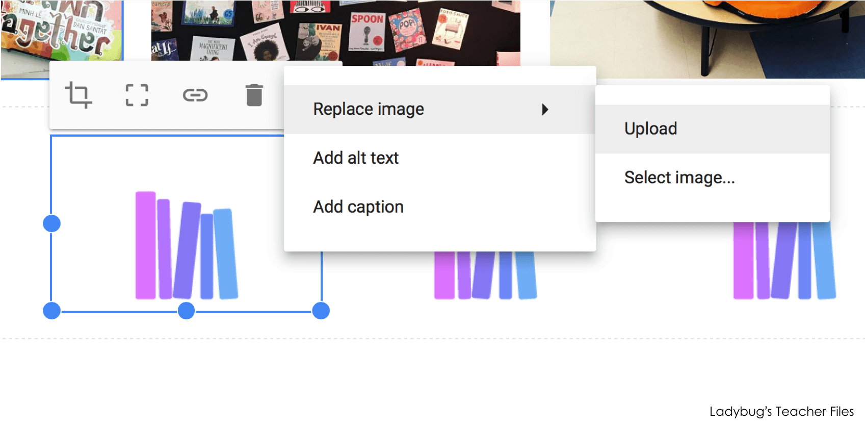
This will make it easy to upload your remaining graphics. Click on the second picture, choose Replace Image and then Upload to change to your next icon:
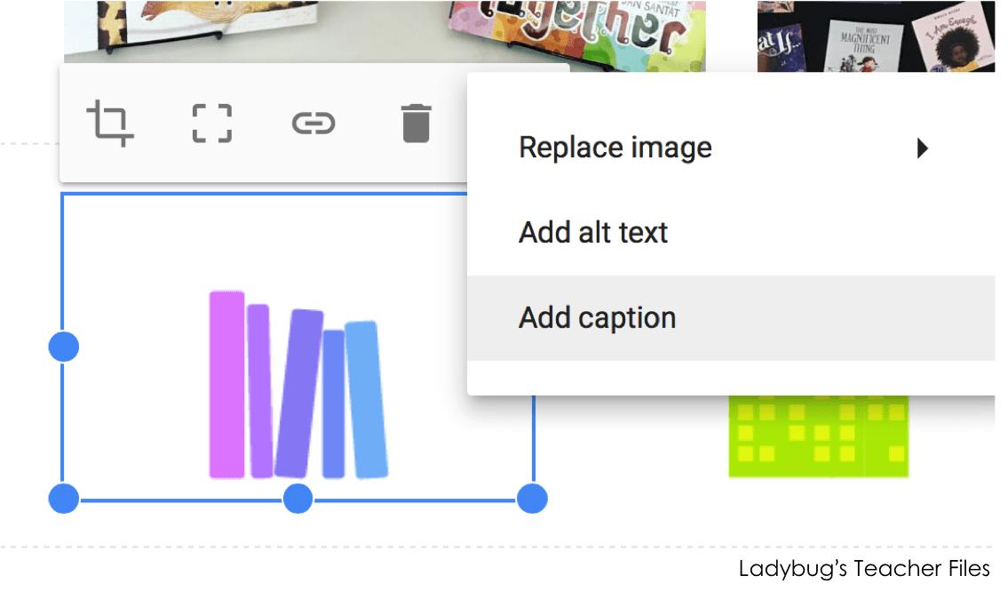
To add text below, click on Add Caption:
Now you will have some nice visuals to help your students navigate your website with ease!

And that’s it for the design part! A few photos and the four sites we use most often.
Here’s a quick overview of the four I chose for my students:
Books We’ve Read
This button leads to a student-friendly Google Form my students use to track the books they’ve read this year as a class.
After they read a book, they will click on the Books We’ve Read button to access the Google Form:
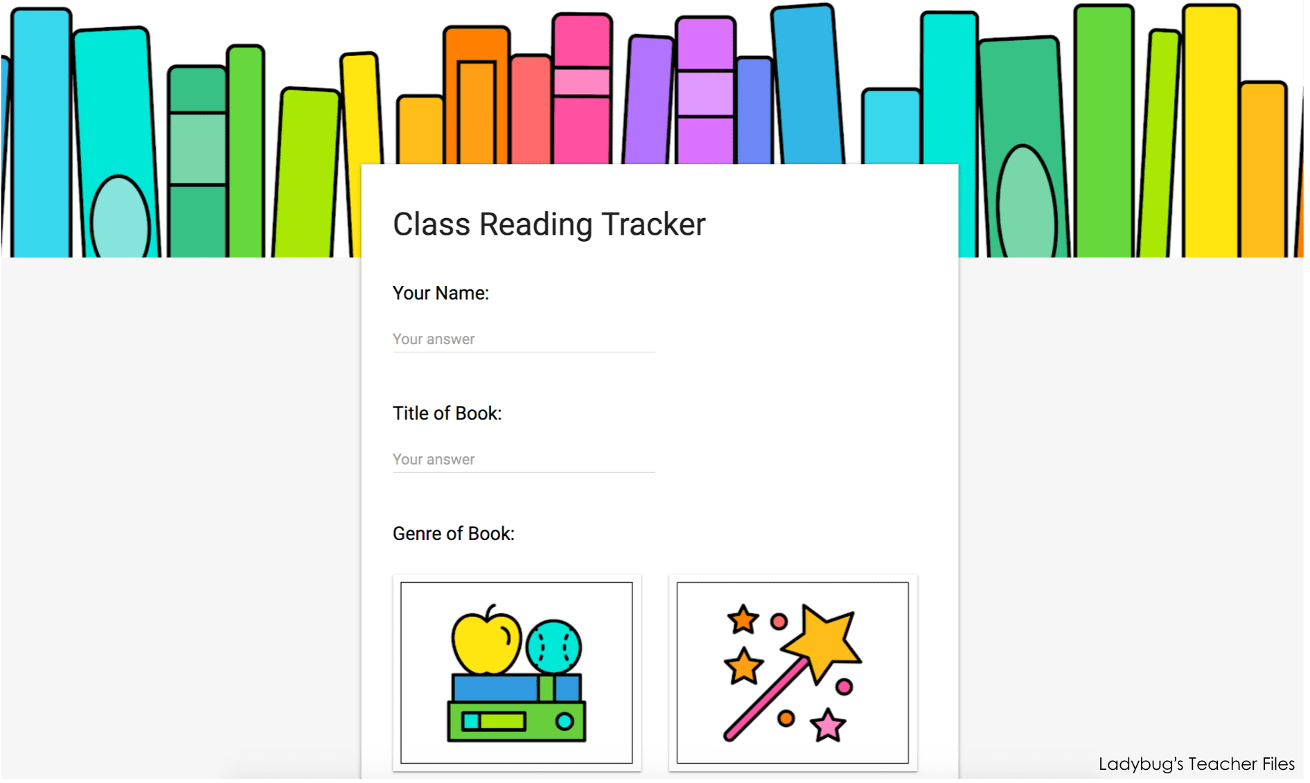
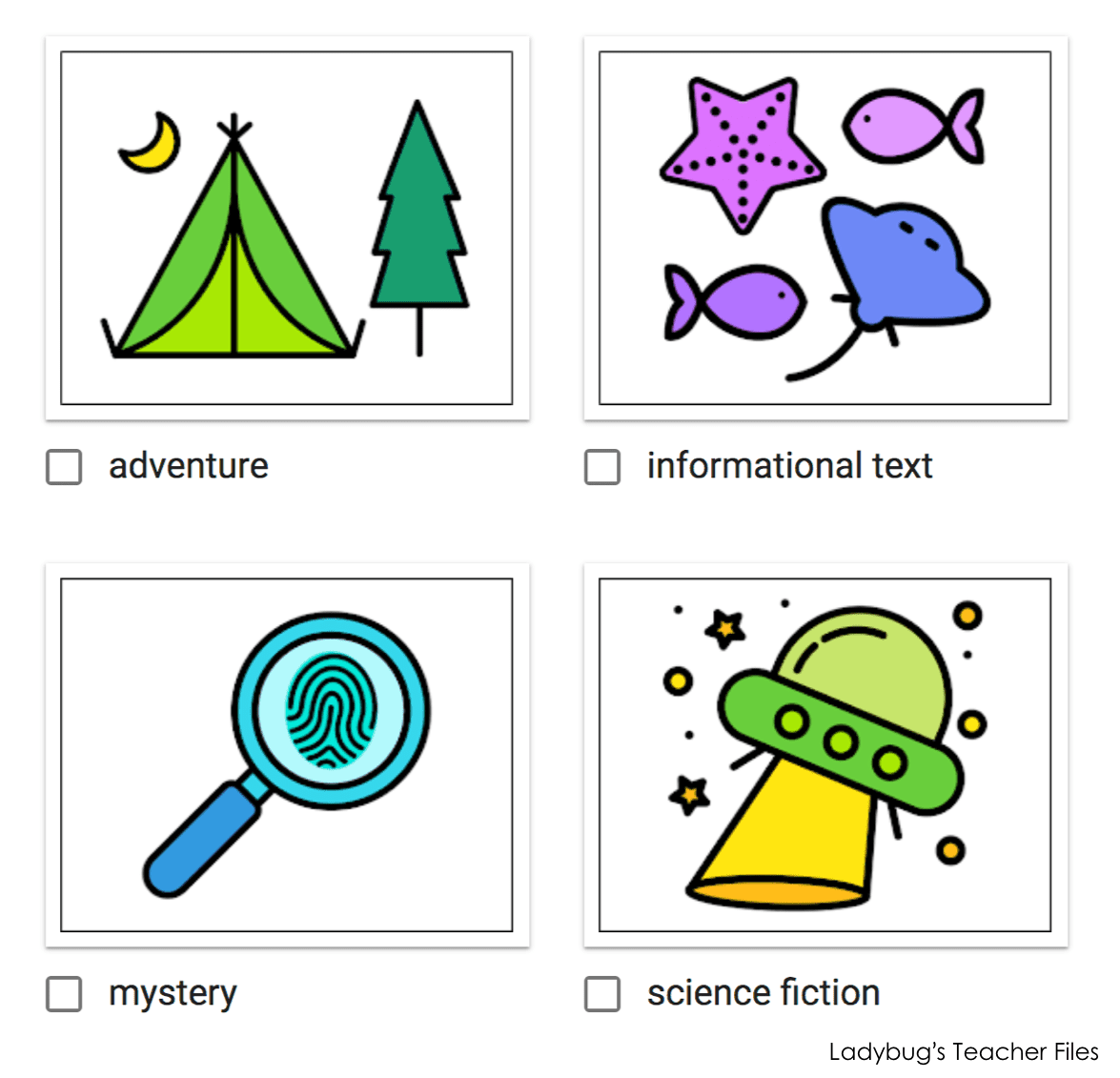
Students will fill out their name, the title of the book they just read, and then select the genre of the book:
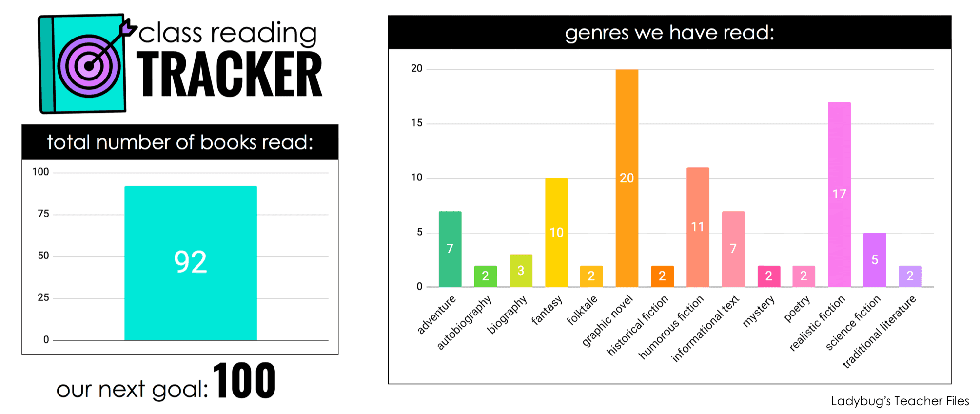
As they enter this data, it is automatically generated into charts we can refer to as a class.
One chart keeps a count of the total books read and the other tallies the genres we’ve read. I’m hoping this will lead to some great discussion about the kinds of books we like to read and inspire my fourth graders to try new genres as well!
(If you’d like to learn more about this resource you can find it in my TpT store…please click the image below to check it out):
The remaining sites are ones I know most of you are familiar with!
Google Classroom
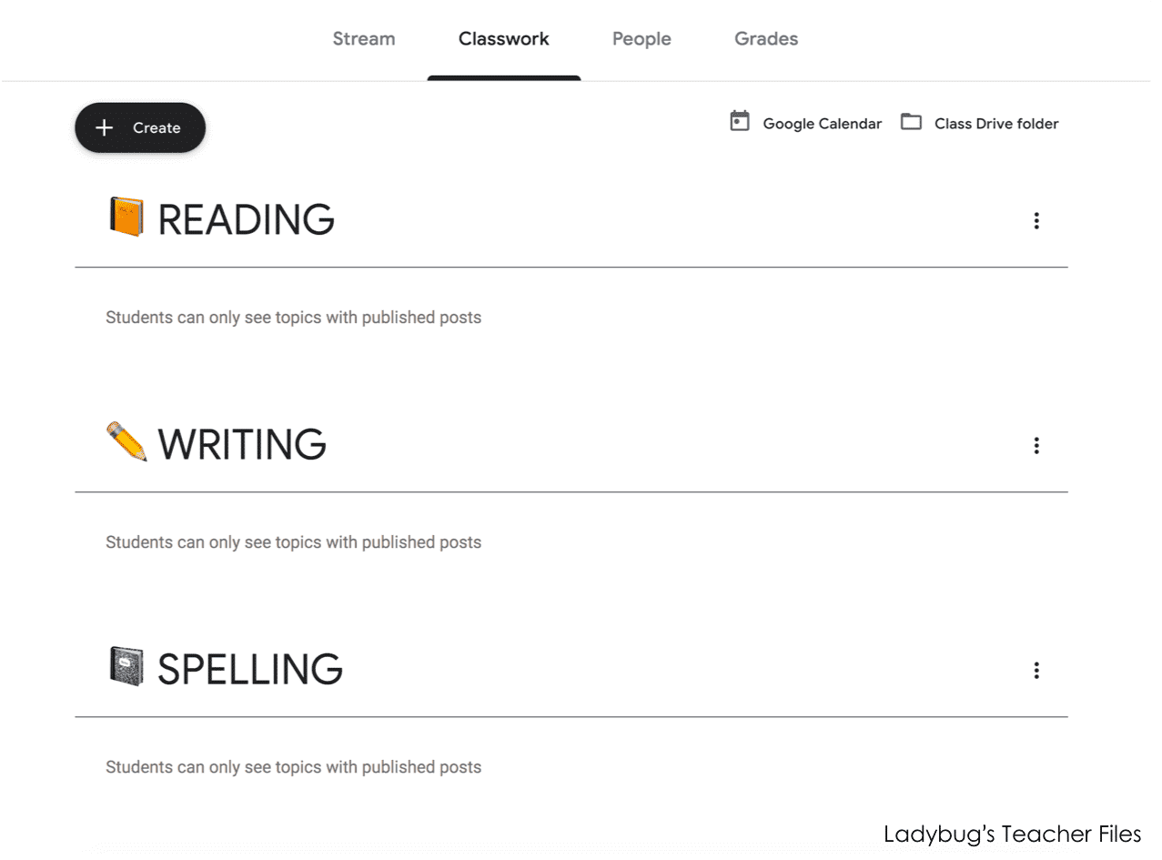
Since many of our assignments and links can be stored here, this is a really important link for us! I have this icon set to jump to our Classwork page on Google Classroom (would you like to learn more about this? I can share soon if so!):
iReady
Does your district use this? We have for the past couple of years…and having a bookmarked link to iReady is key for keeping things moving quickly for us.
My students access their iReady Reading and Math lessons, activities, and assessments on this site.
Spelling City
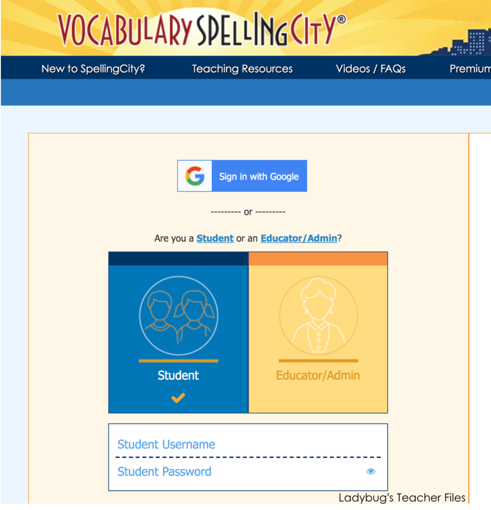
This is another major go-to site for us. I know it’s easy enough to google Spelling City…but it’s faster if I link the exact student sign in page for my fourth graders. Anything to save time!
And that’s it!
My class website is now the hub of all our most-used digital resources.
I hope this was of help if you are trying to do something similar…or using Google Sites for the first time. Thanks so much for reading!
Looking for more Google Drive resources to organize and manage your classroom?
These are my favorite ways to keep myself on track in so many different areas:
Kristen Beakey
I’m an elementary math coach with a passion for sharing beautiful, streamlined solutions to save teachers time. Ladybug’s Teacher Files has been a work of love since 2010. Filled with visual tech tutorials and easy-to-implment math ideas…I strive to save you time in all aspects of your teaching!
